
问题出现情况
移动端写CSS3 时 发现在safari 上 一个元素使用了 transform:rotateY(19deg); 显示有问题。当然 不仅仅是 rotateY, 所有跟rotate有关的都有可能出现问题,当然包括rotate3d。

- 比如这样
.css {
    -webkit-transform: rotateY(19deg)
    transform: rotateY(19deg)
}
- 还有animate.css 中 的翻转
@-webkit-keyframes flipInY {
    0% {
        -webkit-transform: perspective(400px) rotate3d(0,1,0,90deg);
        transform: perspective(400px) rotate3d(0,1,0,90deg);
        -webkit-animation-timing-function: ease-in;
        animation-timing-function: ease-in;
        opacity: 0
    }
    40% {
        -webkit-transform: perspective(400px) rotate3d(0,1,0,-20deg);
        transform: perspective(400px) rotate3d(0,1,0,-20deg);
        -webkit-animation-timing-function: ease-in;
        animation-timing-function: ease-in
    }
    60% {
        -webkit-transform: perspective(400px) rotate3d(0,1,0,10deg);
        transform: perspective(400px) rotate3d(0,1,0,10deg);
        opacity: 1
    }
    80% {
        -webkit-transform: perspective(400px) rotate3d(0,1,0,-5deg);
        transform: perspective(400px) rotate3d(0,1,0,-5deg)
    }
    100% {
        -webkit-transform: perspective(400px) rotate3d(0,1,0, 0deg);
        transform: perspective(400px) rotate3d(0,1,0, 0deg);
    }
}
@keyframes flipInY {
    0% {
        -webkit-transform: perspective(400px) rotate3d(0,1,0,90deg);
        transform: perspective(400px) rotate3d(0,1,0,90deg);
        -webkit-animation-timing-function: ease-in;
        animation-timing-function: ease-in;
        opacity: 0
    }
    40% {
        -webkit-transform: perspective(400px) rotate3d(0,1,0,-20deg);
        transform: perspective(400px) rotate3d(0,1,0,-20deg);
        -webkit-animation-timing-function: ease-in;
        animation-timing-function: ease-in
    }
    60% {
        -webkit-transform: perspective(400px) rotate3d(0,1,0,10deg);
        transform: perspective(400px) rotate3d(0,1,0,10deg);
        opacity: 1
    }
    80% {
        -webkit-transform: perspective(400px) rotate3d(0,1,0,-5deg);
        transform: perspective(400px) rotate3d(0,1,0,-5deg)
    }
    100% {
        -webkit-transform: perspective(400px) rotate3d(0,1,0, 0deg);
        transform: perspective(400px) rotate3d(0,1,0, 0deg);
    }
}
.flipInY {
    -webkit-backface-visibility: visible!important;
    backface-visibility: visible!important;
    -webkit-animation-name: flipInY;
    animation-name: flipInY;
}
表现
- 这是正常状态的表现:
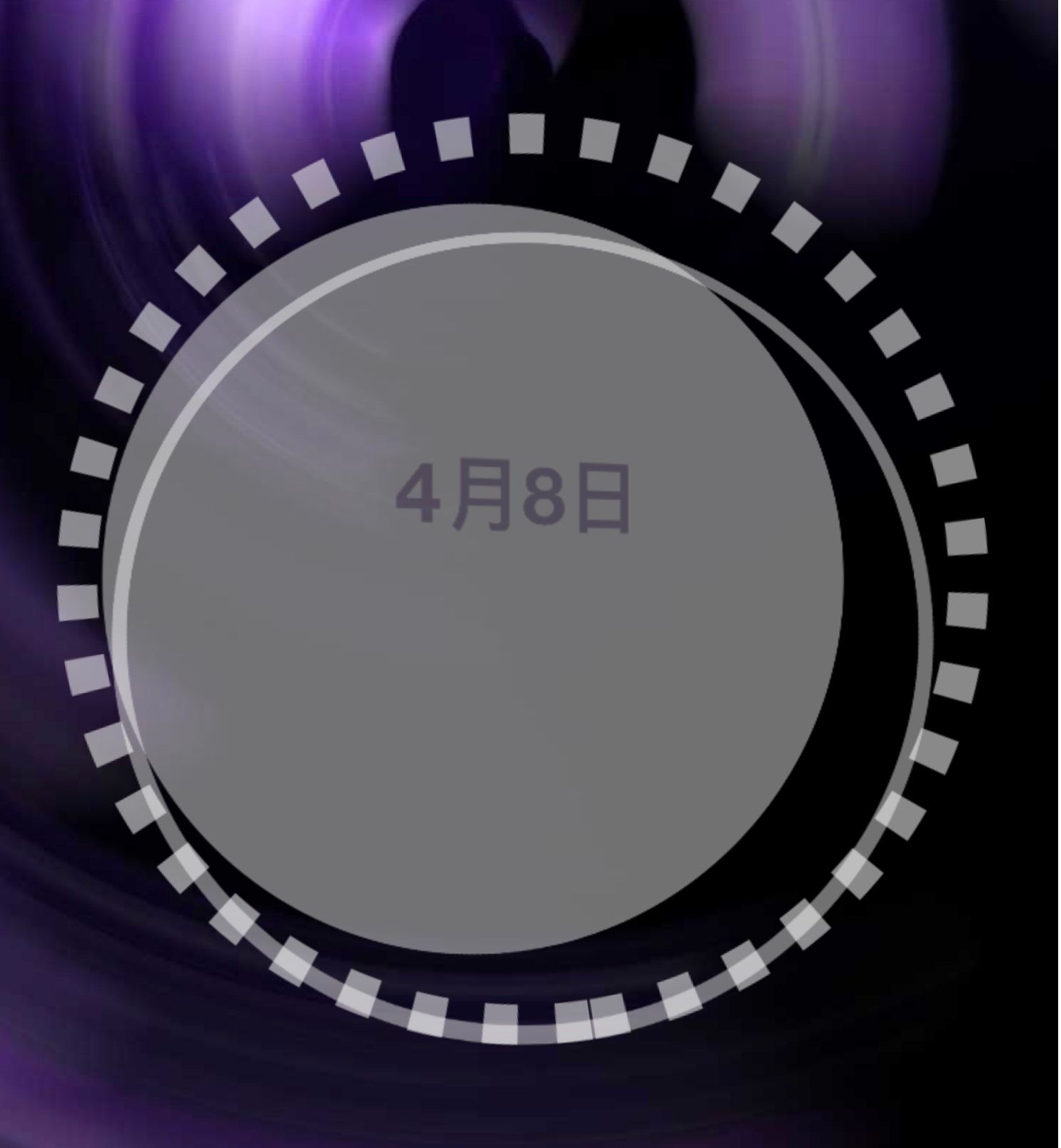
==这中间有两个圆都在进行翻转动画; == - 这是不正常的表现

问题出现了,中间做动画的两个圆 不见了,甚至影响到了最外圈的圆!
此时我把这个背景关闭直接看源码,发现了这么一个情况,见证奇迹的时刻就要来临了!注意看下面三张图
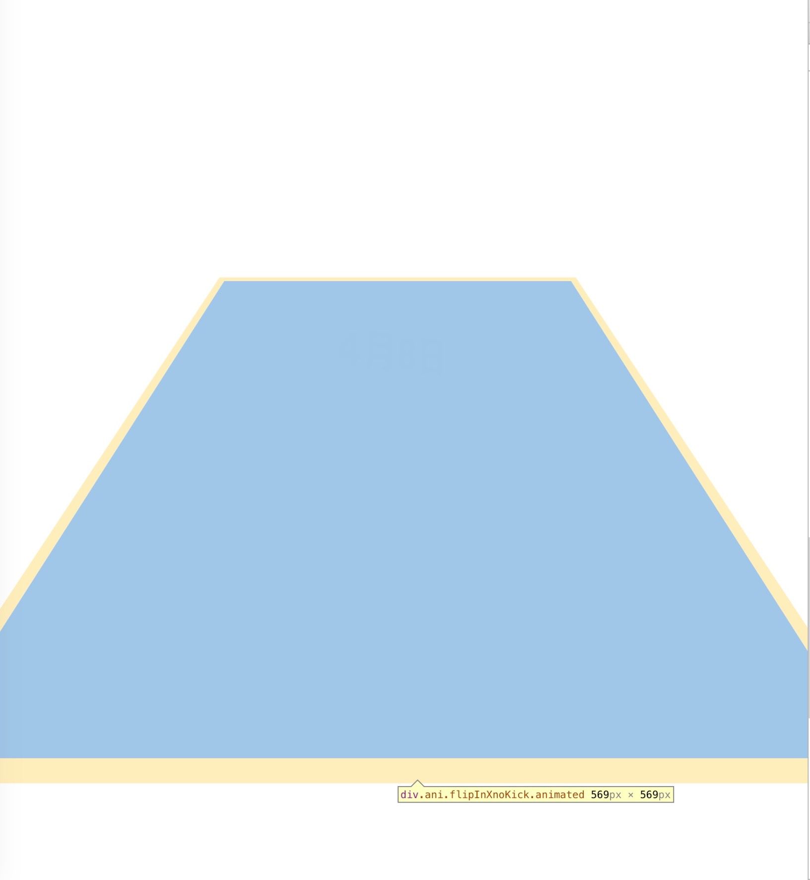
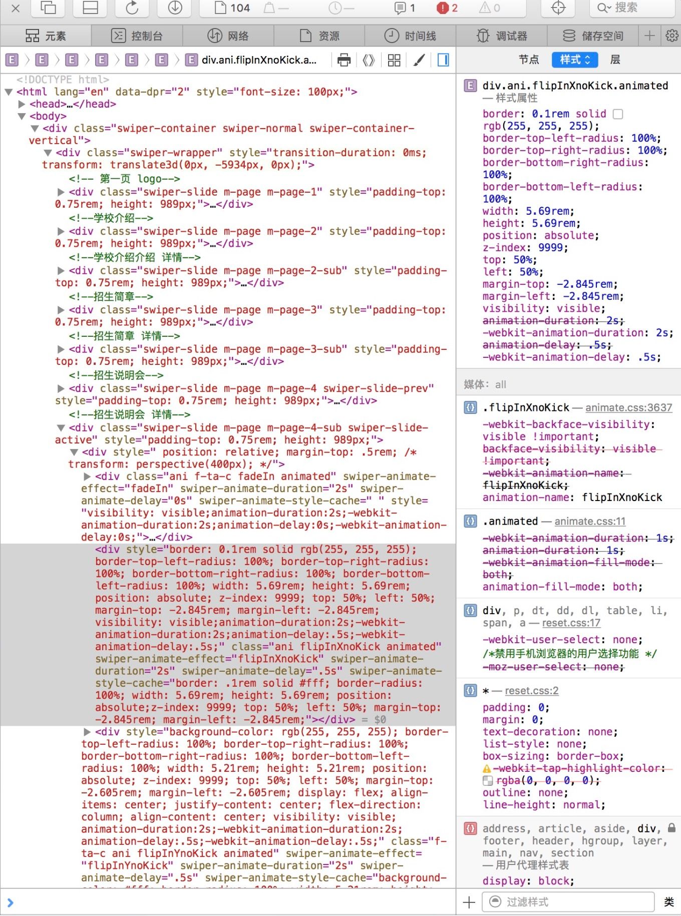

== 动画元素出现了! 这是一个多么激动人心的时刻!==
这是多么神奇的情况!动画元素在其父级的背景图层下展现。。。
这TM就很尴尬了。。。
于是乎各种baidu google bing之。。。终于
解决方案
试着 在父类元素上添加 perspective
先来看看它的介绍
定义和用法
perspective 属性定义 3D 元素距视图的距离,以像素计。该属性允许您改变 3D 元素查看 3D 元素的视图。
当为元素定义 perspective 属性时,其子元素会获得透视效果,而不是元素本身。
注释:perspective 属性只影响 3D 转换元素。
于是乎我在 父级元素加入perspective
.father {
    transform: perspective(400px) // 为啥是400? 因为animate.css中flipInX用到的就是400;我这里是引用了 animate.css 所以 根据它的设定我也设定了400
}
然后。。。你去看看吧。。。反正就是。。。解决了!没毛病!